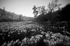
One of the primary problems with getting good
photos of Cahaba lilies is that you are working with a limited
palette of mostly green and white. If we run a web search of
Cahaba lilies it looks something like this:
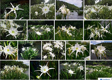
If we take this group of photos as a whole and summarize the
color relationships it looks something like this:

This lack of color variety gives us low color interest.
Furthermore, green is the least interesting color to the human
eye because we see so much of it in nature. Working with it as
the main color presents a challenge to overcome to get
interesting Cahaba lily photos. Now let's examine three ways to
do that.
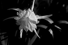
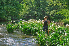
Introduce a third color into the composition.
Adding more colors sounds obvious but most amateur photographers
take photos without even thinking about color relationships.
Actually it's hard to do with Cahaba lily photos because quite
often everywhere you turn is green. If we were to remove the
woman with her blue clothing and gold staff the limited color
relationships would become boring.
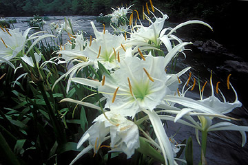
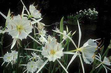
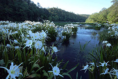
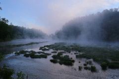
Below are two photos that utilize blue sky and its reflections
to overcome the preponderance of green. Blue is not the best
color to compliment green but if you have a strong composition
it can work.
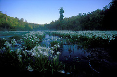
Early morning offers color possibilities that will be gone for
the rest of the day. You don't see many multicolored photos of
Cahaba lilies like the one by Keith Bozeman because you have to
be in the river very early and because Cahaba Lily season
doesn't offer many sunrises as colorful as this.
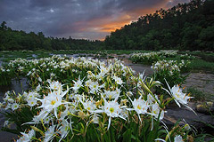
This photo © Keith Bozeman